I thoroughly enjoy looking at implementations of font combinations; the use of space, colour and content are all interesting considerations when choosing which font to use. Browsing fonts on Google Fonts doesn’t get my creative juices flowing (although there’s likely an argument that choosing a font by comparing it to others on a level playing field is good practice), sampling existing sites is a good way to discover font pairings - however you might end up creating a site that looks eerily familiar.
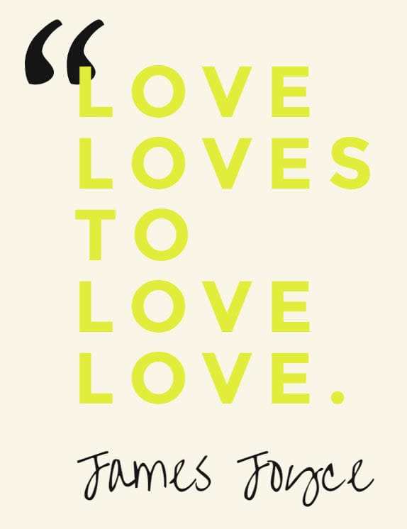
100 Days of Fonts is a project inspired by the 100 Days Project, where someone does something everyday for 100 days. In this case a simple and clean demonstration of font pairing using varied colour schemes and themes. So, if you’re on the lookout for good font duos executed in an original and arty fashion, you know where to go.